A visual cue is a change in the appearance of an application's elements. Visual cues allow users to see the results of their interaction with the interface immediately. There are two types of visual cues: graphical cues and textual cues. For example, if the user places inappropriate information in a text-entry field, the shading of the text-entry field can change to alert the user that the information is unacceptable for that entry field. The shading in the text-entry field is a graphical cue. A textual cue is a more elaborate visual cue that includes messages that provide additional information.
This section discusses the following:
Both the pointing device (such as a mouse) and the keyboard have graphical cues. The graphical cue for the pointing device is the pointer; the graphical cue for the keyboard is the cursor. Pointers inform users about the destination of their pointing device actions; cursors inform users about the destination of their keyboard input. Graphical cues also indicate user actions and the states of controls. Such cues are called emphasis.
Windows and objects also have graphical cues. For example, if an object or window other than the one the user is working with requires attention, the appearance of the object's icon or the window icon could change.
The pointer is a graphical cue, usually in the shape of an arrow, that the user can move with a pointing device. The shape of the pointer provides the user with an important visual cue that indicates the function of the area, element, or control in which the pointer is currently located. The shape of a pointer can also reflect the state of a user interaction or of an input device.
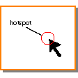
Each pointer shape has a hot spot, which is the actual position on the pointer where input device actions occur (see Figure 2). The pointer can change shape to indicate a change in the function of the current area, but the location of the hot spot should not change on the screen.
View figure. |
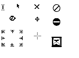
Pointer shape can indicate the function of the area, element, or control in which the pointer is located. For example, a pointer can change to a cannot pointer to indicate that the user cannot complete an action at the current screen location. Figure 3 shows some predefined pointer shapes used in Motif.
You can create new pointer shapes for functions that are not associated with a predefined pointer shape. The shape of the pointer should be associated with its purpose and be easy to distinguish. The shape should not create visual clutter, and the hot spot should be easy to locate. Also, use a predefined shape to symbolize only a function that the shape was designed to represent.
Your application can provide a palette of tools to give users easy access to graphically represented actions. When the user chooses a tool from a palette, the pointer shape changes, and pointer interaction is determined by the chosen tool. For example, choosing a line-drawing tool (such as a pencil) causes a line to be drawn as the user presses a mouse button and moves the mouse.
Figure 3. Predefined Pointer Shapes.
View figure. |
For more information, see the Direct Manipulation, Mouse (Device), Palette Area (Area), Pointer, Pointer (Predefined), and Selection reference pages.
The cursor is a graphical cue that shows where keyboard interaction occurs. Typically only one active cursor appears on the screen at a time.
The user can move pointers freely on the screen; however, the user can move the cursor only to valid cursor positions either on or between elements (for example, to menu bar items and push buttons, but not ordinarily to labels or headings). When the user clicks the pointing device, the cursor appears at the indicated location, if possible. The cursor never affects the pointer location. When the user presses a key, information passes to the operating system, and if appropriate, a response appears or an action occurs at the cursor's position.
The appearance of the cursor changes, depending on its location. Therefore, cursors are sometimes categorized by their appearance and location. The way the user moves the cursor depends on the type of input device being used. See "Input Devices" for information about input devices.
There are three types of cursors: element cursors, text cursors, and graphics cursors. The following list describes each of these cursors:
For more information, see the Cursor, Input Focus, Keyboard (Device), Selection, and Text-Entry Field (Control) reference pages.
Emphasis is a graphical cue that distinguishes one element or group of elements from another and conveys information to a user. You typically use emphasis to indicate that an element or group of elements is:
You can use emphasis to display other kinds of information appropriate for a specific application.
The type of emphasis you use should be determined by the interaction the user has with an element. More than one type of emphasis can be valid on an element at the same time; therefore the user can see different emphases simultaneously.
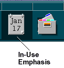
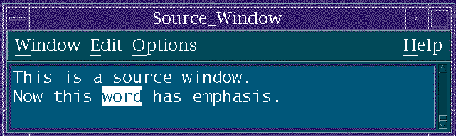
In-use emphasis indicates that at least one view is currently open on an object; the user can still interact with the object (see Figure 4).
View figure. |
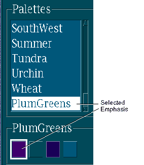
Selected emphasis indicates that the user has selected an element (see Figure 5). For more information about selection, see "Selection".
View figure. |
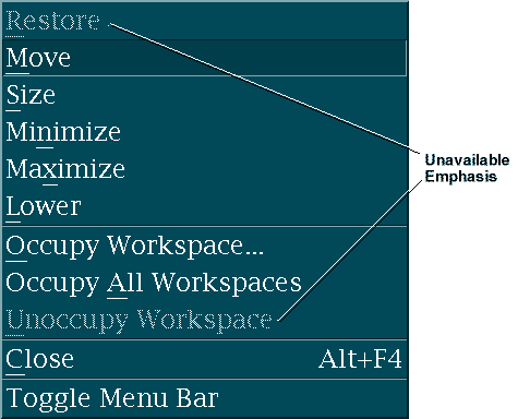
Unavailable emphasis indicates that the user cannot use a control at that time (see Figure 6). A control with unavailable emphasis often appears dimmed compared to surrounding elements.
Figure 6. Unavailable Emphasis.
View figure. |
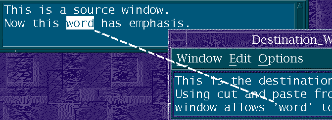
Source emphasis indicates that an element is the source of an action, for example, the source of the element that the user is copying (see Figure 7). Source emphasis remains in effect until the action is completed.
View figure. |
Target emphasis indicates the element that is the receiver of an operation (see Figure 8). When the user drags an item over an element on which it can be dropped, target emphasis is shown on the element. Target emphasis can indicate where the source element will be placed in the target element.
View figure. |
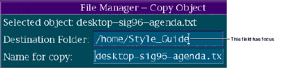
Focus emphasis indicates which window or element will receive user input (see Figure 9). For more information about focus emphasis, see "Interacting with the Interface".
View figure. |
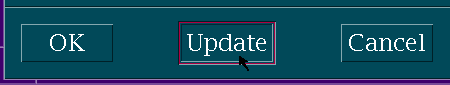
Ready emphasis, also known as armed emphasis, indicates that a control will be activated when the user completes the current action (see Figure 10). For example, when the user presses the SELECT button while the pointer is on a push button, the push button displays ready emphasis to show that when the user releases the SELECT button, the push button will be activated.
Figure 10. Ready Emphasis on the Update Push Button.
View figure. |
Often, when the user presses a push button, the push button appears to be pushed in to indicate ready emphasis.
Interacted emphasis indicates the control with which the user last interacted and which can be edited. It indicates which control is to be modified by various keyboard and menu-driven actions that paste data.
For more information, see the Copy To (Dialog Choice), Input Focus, and Move To (Dialog Choice) reference pages.
When the user needs more information than can be conveyed with an audible or graphical cue, you can use a textual cue. A textual cue consists of a word or words that describe the current situation. You can display textual cues in various ways, including as information in a status area, as information in a message window (or messages), and as help information.
Messages provide detailed information to the user. They are appropriate when the information is particularly important or urgent. Messages can both describe a problem and explain how to correct the situation.
Besides text, messages can contain push buttons that help the user decide how to continue and graphics to indicate the message type. Some message windows contain groups of controls that allow the user to make more extensive corrections from the message window.
A message should clearly indicate why the message appeared and what actions can be taken. You can always provide access to help information in any kind of message to further help the user. Messages should be written so that a user unfamiliar with the operating system can understand the message and know how to proceed.
There are five types of messages:
Use an information message when a situation occurs that the user may need to know about; for example, indicating that the user has received new mail (see Figure 11).
Figure 11. Information Message.
View figure. |
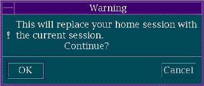
Use a warning message when the user should be aware of an existing situation but can continue working (see Figure 12). You can provide other actions to allow the user to modify the original request or to cancel it. For example, you can include a text-entry field that allows the user to enter a different file name if the file name originally chosen is a preexisting file name.
View figure. |
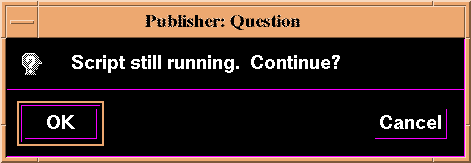
Use a question message when a situation arises that does not require the user's immediate attention (see Figure 13).
A question message can contain controls, such as a text-entry field, that allow the user to attempt to correct data that is invalid or incorrect. For example, a question message could contain a text-entry field to allow the user to indicate a new printer name if the current printer is out of paper, thus providing an alternate method for completing the task.
View figure. |
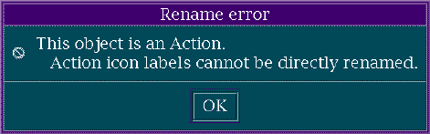
Use an error message when a situation requires the user's immediate attention (see Figure 14).
An error message can contain controls, such as a text-entry field, that allow the user to attempt to correct data that is invalid or incorrect. For example, an error message could contain a text-entry field to allow the user to indicate a new printer name if the requested printer is not available.
View figure. |
Use an in-progress message to provide feedback to the user during long processes (typically 15 seconds or more). An in-progress message indicates progress toward the completion of a process, such as copying or sorting a group of objects or files (see Figure 15).
An in-progress message can indicate a specific amount of time. For example, it could contain a digital clock that displays the time remaining in a process. An in-progress message can also indicate a relative amount of time.
Figure 15. In-Progress Message.
View figure. |
For more information, see the Action Message
Your application should provide information to the user about how to use the application and how to recover from exceptions. This information is known as help information.
Ideally, an application's help facilities should work together with its methods and mechanisms for exception handling to provide the user with all of the information needed to solve any problem.
Help information describes your application and user interaction. Help information might include information on how to perform a task or reminders for users who already know how to perform the task but need to know more detailed information. The information you provide should be clear, concise, and written in everyday language. In addition, the user needs to be able to access and leave help information easily.
Your application should provide several types of help information, including information about:
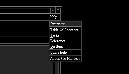
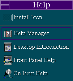
Your application should also provide an index of all of the topics for which help is available. Figure 16 lists types of help information in various help menus.
Figure 16. Types of Help Information.
View figure. . View figure. |