[ Previous |
Next |
Contents |
Glossary |
Home |
Search ]
Motif and CDE 2.1 Style Guide Reference
Radio Button (Control)
Reference
Description
A radio button and radio button box are defined as follows:
Radio buttonRepresents a value choice that can either be on or off and that is part of
a mutually exclusive group of radio buttons.
Radio boxA group of mutually exclusive radio buttons that are grouped together.
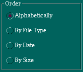
Figure 53 shows an example of a radio box and radio buttons.
Figure 53. Radio Box and Buttons.
When to Use
RecommendedUse a radio box to display mutually exclusive value choices that have
textual labels.
Guidelines
RequiredThe radio buttons in a radio box are mutually exclusive. When the user
sets one radio button, unset any other radio button in the radio box.
RecommendedIf a value choice can only be set or unset, and is not part of a larger
set of choices that are not mutually exclusive, use a check box instead of two
radio buttons.
RequiredIf the values represented by the radio buttons in a radio box cover all
possibilities, do not allow the user to unset the radio button that is set.
Attempting to do so should have no effect.
RequiredIf the values represented by the radio buttons in a radio box do not cover
all possibilities, then allow the user to unset the radio button that is set.
RecommendedEnsure that the radio buttons in a radio box cover all possibilities. If
necessary, add a radio button labeled None (or the equivalent) that covers any
remaining possibilities.
RequiredWhen a radio box represents a value shared by multiple selected
elements:
Display the radio buttons as selected if that value applies to all of the
selected elements.
Do not display any of the radio buttons as selected if not all of the
selected elements have a matching value.
RequiredWhen a radio box represents a property shared by more than one selected
element, ensure that the property of all selected elements corresponds to the
radio button that the user sets.
RecommendedWhen a radio box represents a property shared by more than one selected
element, and the user must be able to restore the properties of each of the
selected elements after setting one of the radio buttons, then add another
radio button that represents the initial state (such as No Changes). Display
this button as set when no other value in the radio box applies to all the
selected elements. When the user sets this radio button, restore the
properties for each selected element to the value it had when this radio
button was last set.
RequiredDesign a radio button with a graphic that indicates the state of the
button and a text label that describes the state it controls.
RequiredUse at least two radio buttons in a radio box.
RecommendedArrange radio buttons in a group of rows, columns, or both.
RecommendedUse a filled circle, diamond, or square as the graphic for the radio
button.
RecommendedIf you support color, use a color different from the other application
colors to create a visually distinct on state. If you do not support color,
represent the on state as either white or black, depending on the background
being used.
Essential Related Topics
For more information, see the Control reference page.
Supplemental Related Topics
For more information, see the Check Box (Control), Choice, Label, and
Value Set (Control) reference pages.
[ Previous |
Next |
Contents |
Glossary |
Home |
Search ]