[ Previous |
Next |
Contents |
Glossary |
Home |
Search ]
Motif and CDE 2.1 Style Guide Reference
Cursor
Reference
Description
A cursor is a visible cue that indicates where the user's interaction
with the keyboard will be performed. There are three types of cursors:
element cursors, text cursors, and graphics cursors.
Element Cursors
An element cursor indicates that a control can be activated or
manipulated, but the control cannot be edited. An element cursor can be any of
the following:
BoxA box drawn around an element. This is the default element cursor. It
usually has solid borders, but should have dashed borders when used within a
selection scope in add mode.
ShadowAn outline with a shadow effect around a control. Provide the shadow shape
on a control whose outline is not normally shown, for example, the menu
system.
HandlesSolid or hollow square boxes that surround an object (sometimes called
resize borders). You typically use handles in applications when the size,
position, or shape of an element can be resized.
Figure 11 shows each type of element cursor.
Figure 11. Element Cursors
%>| Box Cursor: |
View figure. |
| Shadow Cursor: |
View figure. |
| Handles: |
View figure. |
Text Cursors
A text cursor indicates the location in text at which characters are
inserted or pasted. The text cursor is usually a vertical bar or I-beam
between characters when in insert mode and a box over a character when in
replace mode. A text cursor should blink when the text has the input focus. A
text cursor can be any of the following:
Vertical bar or I-beamA vertical bar or I-beam in text to indicate where text may be inserted
(insert mode). The bar should blink when the text has input focus.
Block or underlineA shaded block behind the character (or sometimes a line under a
character). Use it to indicate that it will be replaced (replace mode) by the
next character typed. The box or underline may blink when the text has the
input focus.
Figure 12 shows each type of text cursor.
Figure 12. Text Cursors
%>| I-Beam Cursor: |
View figure. |
| Block Cursor: |
View figure. |
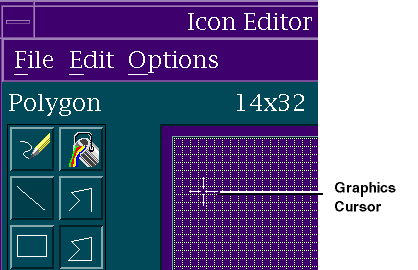
Graphics Cursors
A graphics cursor identifies an (x,y) location within a selection scope
that indicates the current edit point within a graphics area. You typically
use a cross-hair, circle-dot, or circle-X as a graphics cursor to distinguish
it from any sighting pointer in the scope.
Figure 13 shows a graphics cursor.
Figure 13. Graphics Cursor.
When to Use
RequiredWhen using an explicit focus policy, use an element cursor on a control to
indicate focus emphasis, unless a cursor is visible on some element within the
control.
RequiredUse a text cursor at the appropriate point when a control is in a state
where characters typed by the user may be inserted in the control or in which
characters displayed within the control may be selected.
RequiredUse a graphics cursor in a control when keyboard users need to be able to
place elements at specific (x,y) positions or to select elements within an
arbitrary rectangle.
RequiredUse an element cursor on a control to indicate focus emphasis if a cursor
is displayed within that control but is not visible because it is clipped or
scrolled out of view.
RecommendedAlways use an element cursor on a control to indicate focus emphasis.
RecommendedWhen the purpose of a control is to allow a positional indicator to be set
to a value (for example an arm in a slider), indicate focus emphasis with an
element cursor on the positional indicator.
RecommendedWithin a selection scope in which the user can move elements to arbitrary
positions, use an element cursor within the scope instead of a graphics cursor
if and only if the following are true:
Automatic placement is acceptable for newly added elements to the scope
Elements rarely need to be moved by the user
Support is provided for keyboard-based drag and drop
Area selection of more than a few elements is rare
Guidelines
RequiredA control that uses a text or graphics cursor must keep track of the
cursor position even when the control does not have focus.
RecommendedWhen designing new controls, use one of the existing cursor styles.
RequiredWhen the user clicks the SELECT button at a legitimate cursor position
within a control that uses keyboard navigation to move the cursor, move the
cursor to the location at which SELECT was clicked.
RequiredWhen the user presses Ctrl SELECT at a legitimate cursor position within a
control that uses keyboard navigation to move the cursor, move the cursor to
the location at which SELECT was pressed, but do not perform any other action,
unless pressing Ctrl SELECT already has a predefined meaning in that control.
RequiredText and graphics cursors should not track the pointer; they should only
move via keyboard navigation or when a mouse button is pressed, even when in a
window that uses an implicit focus policy.
RequiredAn element cursor used within a control (other than a spring-sensitive
control) should not track the pointer when in a window that uses an explicit
focus policy.
RecommendedAn element cursor used within a control should track the pointer when in a
window that uses an implicit focus policy.
RequiredWhen using keyboard navigation, do not skip over an element solely because
it is obscured by another window or by an icon in the workspace.
RecommendedIf an element is obscured by other elements in the same window, allow
keyboard navigation to it only if it can be made visible within the window.
RequiredIf a control keeps track of a cursor position within the control even when
the control does not have focus, do one of the following:
Make the cursor more visible when the control has focus.
Place an element cursor on the control as a whole when it has focus.
RequiredIf a control hides a cursor but keeps track of its position within the
control when the control does not have focus, then when the control gains
focus, show the cursor at the position it was in (relative to the underlying
data) when the control last had focus, unless the application has changed the
data or cursor position in the meantime.
RequiredWithin a selection scope that supports add mode and normal mode, change
the appearance of the cursor, depending upon the mode. In particular, when an
element cursor is used, draw a solid box around the element in normal mode and
a dashed box around the element in add mode.
RequiredMake sure that a text or graphics cursor used in a control is clearly
distinguishable from the shape of the pointer when it is in that control.
RequiredTo make a cursor more visible when the control containing it has focus,
use one of the following methods:
Darken the cursor when the control has focus and dim the cursor when the
control does not have focus.
Use a blinking cursor when the control has focus and use a static cursor
when the control does not have focus.
Show the cursor when the control has focus and hide the cursor when the
control does not have focus (except when the cursor is being used to show
interacted emphasis).
RecommendedIf a control keeps track of a cursor position within the control even when
the control does not have focus, make the cursor more visible when the control
does have focus.
RecommendedIndicate when a graphics cursor is on an element, for example, by also
showing an element cursor on the element.
RequiredWhen insert mode is being used, display a text cursor as a vertical bar or
I-beam at the cursor position.
RequiredThe size of the I-beam cursor should be proportional to the current font.
RequiredWhen replace mode is being used, use a block or underline to make the text
cursor appear to be displayed on a character, though it actually is positioned
immediately before that character.
RecommendedMake a cursor distinct from any other form of emphasis.
Supplemental Related Topics
For more information, see the Choice, Pointer, Scrolling, and
Text-Entry Field (Control) reference pages.
[ Previous |
Next |
Contents |
Glossary |
Home |
Search ]