This section discusses the drag-and-drop operation and provides CDE guidelines for incorporating drag and drop into your CDE application.
You should be familiar with the description of Motif drag and drop. For more information, see "Data Transfer". Where differences occur, this section supersedes "Data Transfer" when developing applications for CDE.
CDE has incorporated two changes to mouse-based selection that is significantly different than in Motif. The first is that the user may elect to have either adjust or transfer capability on the middle mouse button. In addition, CDE integrates drag and select on the first mouse button.
On a 3-button mouse, MB2 is typically used as the TRANSFER (or SELECT) button. However, in CDE the user may change an environment setting to indicate that MB2 should be used as the ADJUST button. The ADJUST button can be used to toggle the selection state of elements under the multiple selection model.
In CDE the user can select and drag icons in File Manager, mail messages and attachments in Mailer, appointments in Calendar, and text from text editors or text fields. The user can drop items onto any drop zone that accepts them. For example, a document icon from File Manager can be dropped onto a folder icon in File Manager, onto the Print Manager icon in the Front Panel, or onto the attachment list in Mailer.
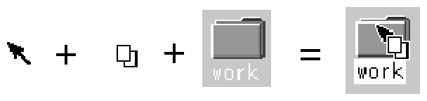
The drag icon consists of three parts:
Figure 60 shows these parts.
Figure 60. Parts of a Drag Icon.
View figure. |
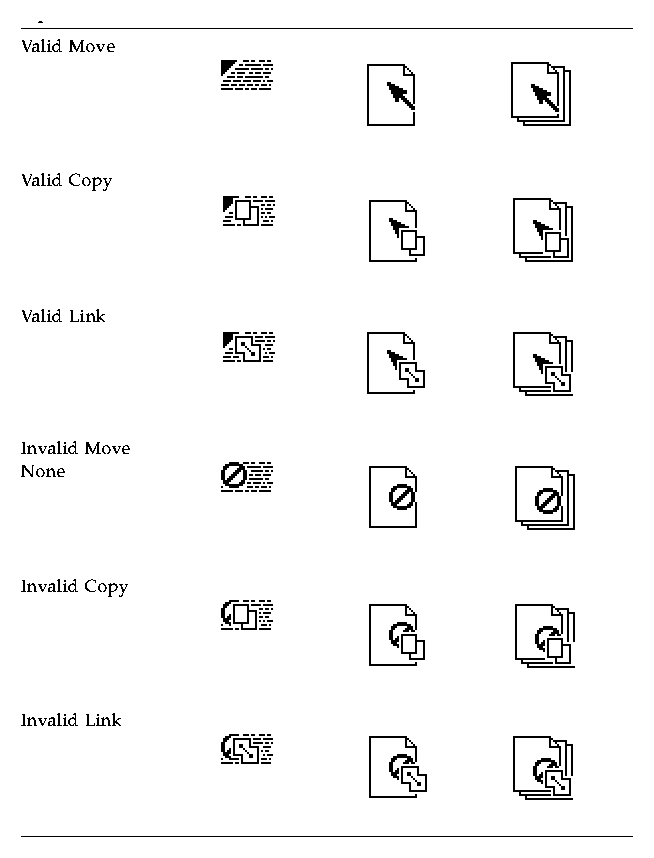
The state indicator is a positioning pointer combined with a valid or invalid drop zone indicator. The valid state indicator should resemble an arrow pointer with a hot spot so the user can position the cursor in a predictable manner. The invalid state indicator, a cannot pointer, appears when the user is over an invalid drop zone. Figure 61 shows an example of an invalid state indicator.
Figure 61. Invalid State Indicator.
View figure. |
The operation indicator gives the user feedback on what operation is occurring during the drag. Figure 62 shows the copy and link feedback. Because most drags are move operations, an operation indicator is added to the drag icon only for copy or link operations.
Figure 62. Operation Indicator.
View figure. |
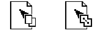
The source indicator is a representation of the selection (or the item being dragged). It comes in several versions, depending upon whether the selection represents single or multiple items and what kind of item the selection represents. Figure 63 shows examples of source indicator drag icons.
View figure. |
The hot spot for text drag icons is located on the top left corner (1,1). The hot spot for single and multiple drag icons is located at the top left pixel of the invalid icon (3,3). CDE has tuned each drag icon to increase user accuracy at targeting and positioning.
You are responsible for supplying a graphic to be used in the drag icon in your application. This graphic is usually one of the icons already supplied with the application, such as the 32x32 icons that File Manager uses to represent documents. The graphic used depends on what is being dragged.
In cases where the user does not select an icon to start a drag, it is still appropriate to show a relevant graphic in the drag icon, especially if that graphic will be used by the destination application upon the drop. For example, in Calendar Appointment Editor, the user can select an appointment from the scrolling list, which does not show icons. An appointment icon is used as part of the drag icon. If the appointment were dropped on File Manager, File Manager would display the appointment, using the same graphic.
In CDE three operations are associated with the drag icon. These operations are explained in "Parts of a Drag Icon". The drag icon has alternate graphics that indicate to the user when the operation is a copy or link. The default operation, move, requires no alternate icon graphics.
The user needs an indication that the drag-and-drop operation either succeeded or failed. You should use transition effects to indicate the success or failure of the drop. There are two kinds of transition effects: melt and snap back.
Use the melt effect when the user drops a drag icon on a valid drop zone. The effect looks like the drag icon melts into the drop zone. The drag icon disappears and is replaced by whatever is appropriate for the destination application. Dropping a drag icon on the Print Manager control in the Front Panel may show nothing other than the melt effect. Dropping a drag icon on the File Manager control would show the melt effect followed by the icon appearing in File Manager.
Use the snap back effect when the drop fails. Drops can fail for two reasons: because the drop zone is invalid or because the data transfer fails. If the user drops a drag icon over an invalid drop zone, one that shows the cannot pointer drag icon, then the drag icon snaps back to the source application.
Once a drop occurs, the source and destination applications have to transfer the data. If the data transfer fails, the destination application should do the following:
Sometimes the transition effect does not take place immediately. The icon appears where it is placed until the transfer is done. During this time, your application should set the cursor to the busy state. The user cannot move or select the icon until the transfer is complete; the busy cursor tells the user the transfer is in process.
You should understand the following areas of the CDE underlying application architecture when designing a drag-and-drop operation:
There are three types of draggable objects in CDE:
Each application has its own objects that can be dragged and dropped. For example, Calendar uses appointments, Mailer uses mail messages, and File Manager uses folders and files.
The folder and file icons in File Manager exist as separate entities in the underlying file system and are, therefore, treated as files when dragged and dropped. However, Calendar appointments and Mailer messages do not exist as separate entities in the file system. When a user drags these objects they are treated as buffers.
Text selections fall into a different category because selecting a piece of text is different than selecting an icon. The user selects a range of text in a document window; the text does not represent the whole document -- only a piece of a document. Rarely does a user see the piece of text as a distinct object and the user does not expect a piece of text to behave like an icon when dropped. For this reason, the drag-and-drop model for text mirrors the cut, copy, and paste operations available from the Edit menu.
There are two actions that can occur when an object is dropped: insert or load.
The insert action inserts the dropped object into the destination, adding it to the current data in the application or document. The object is inserted when a user schedules an appointment, prints a document, attaches a document, pastes text, or appends a mail message. Such an action is a move or copy operation, depending on the destination and the user. The user might decide to copy a piece of selected text as opposed to moving it. The drag icon should indicate whether the operation is a copy or move.
The load action operates the same as if the user had chosen Open from the File menu, selected a file, and clicked the Open button. The dropped object gets loaded into the application. The user can edit it and save changes back to the original file. Load works only with files at this time, not with buffers or text. The user should see the copy drag icon when dragging an object over a drop zone that supports the load action.
Load works with buffers; however, buffers are loaded as read-only.
When designing drag-and-drop operations for an application, you must understand how Motif decides which operation executes when the source and destination of a drag and drop do not match.
For each drag source, an application advertises which drag-and-drop operations are possible and on what destinations the drag source can be dropped. For each drag destination, the application advertises the possible sources and the types of operations. If a source and its destination have two or more operations in common, Motif follows a specific order to determine which operation to use. That order is move, copy, link. The application cannot change the operation that is accepted based on the type of item being dragged.
For example, application A might allow an element to be moved or copied. Application B might allow the destination to accept a copy or link. The intersection in this example is copy. If the destination in application B accepts move or copy, then the source is moved because the move operation comes first in the operation order.
In this example, the user could override the move operation by holding down a modifier key, for example Ctrl, to make the operation a copy. This will work if the copy operation is in the common set of operations. If the copy operation is not in the common set, then the drag becomes an invalid drag.
The only time you may have to consider matching operations is when you have a destination that accepts moves but functions better with copies. In that case, the destination should accept only copies because accepting a copy broadens the scope of acceptable drops. In most cases where a move is accepted, a copy would work just as well. Remember that move is implemented as a copy followed by a delete.
If you use drag and drop in an application, you must decide what control elements can be dragged and how those elements are to be represented. Typically, the user selects something like text or a file to drag, but the application may also allow a drag-and-drop of other elements, such as mail messages or appointments.
This section provides general guidelines for determining drag sources and then discusses specific elements that can be dragged.
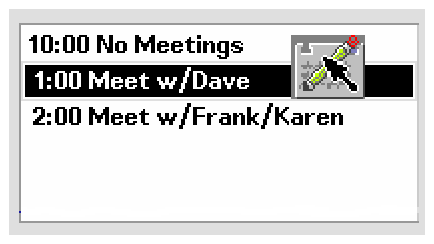
In CDE, items in a scrolling list are text objects by default. They can be buffer objects, but they cannot be both text and buffer objects. For example, the Calendar Appointment Editor has a scrolling list of appointments that the user can select and drag. When dragging an appointment, the user is manipulating a buffer and the drag icon shows an appointment icon as the source indicator (see Figure 64). A Mailer container window has a list of mail messages in the upper portion of the window. Users can select and drag one or more messages from this list. These messages are actually buffers and the drag icon shows a mail message as the source indicator. If multiple mail messages are dragged, then the drag icon shows the multiple source indicator.
Figure 64. Scrolling List with a Draggable Item.
View figure. |
If your application uses a scrolling list to show mail message headers or to list other kinds of objects, then you need to integrate dragging with an extended selection model, as in the Mailer application.
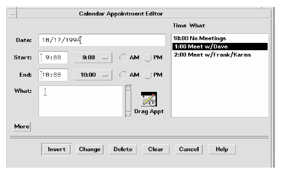
Sometimes the user needs to be able to drag from inside a dialog box. For example, in the Calendar Appointment Editor there are a series of text fields on the left side where the user enters information about an appointment. Allowing drags from this area lets the user drag text from the appointment description.
The recommended method for indicating that the user can drag something is to include a draggable icon graphic in the dialog box. This icon graphic must be the same icon that represents data in File Manager. In Calendar, the appointment icon is shown just as it would appear in File Manager (see Figure 65), with a label under it. This is the same icon that the drag icon source indicator uses. Place the icon graphic in the dialog box adjacent to the information to be dragged. The upper right corner of the dialog box or window is the default position, but you can change it for your application. In Calendar Appointment Editor, the icon is placed near the main text field to indicate that you can drag the text fields.
Figure 65. Calendar Appointment Editor Dialog Box.
View figure. |
In some applications, you might want to allow the user to drag an entire document or file. For example, in Icon Editor, you might want to allow the user to drag the file for an icon currently in the editor. You should incorporate a draggable icon graphic in the window of your application to indicate that the user can drag the document or file. In the case of Icon Editor, you can use one of the icons for displaying the contents of the icon file. Follow the guidelines for icons used in dialog boxes. For example, the icon should:
When the user selects more than one item to be dragged, change the drag icon to indicate there is more than one item selected.
Some drop zones may be able to accept only a single item. A drop zone cannot differentiate between a single and a multiple set of items being dropped. Since the drop icon does not display the cannot pointer, melt the items in and then have the destination application snap them back. Follow the snap back with an error notice that tells the user why the drop failed.
The standard supported drop zones in CDE are Front Panel controls, open windows, and some icons in File Manager, including folder and action icons. CDE does not support dropping on minimized icons and on File Manager icons that do not support drops.
The Front Panel is a collection of controls and other functions that provide the user with easy and fast access to the operating system. As a consequence, its drag-and-drop behaviors are heavily dependent upon the context of the destination. For example, if the destination is a printer, then the system should print it. If the destination is a subpanel, then the system should install it in the subpanel. Most applications will not vary in behavior quite as broadly as the Front Panel.
File Manager for CDE allows the user to drop an icon on the desktop, where it becomes a reference. Within File Manager windows, File Manager allows dropping onto icons other than folders and action icons. For example, dropping a mail message icon onto a mail container icon appends the mail message.
When mail messages or calendar appointments, or other buffers, are dragged from the source application and dropped onto File Manager, they must be named. The underlying API supports a name field for the item being dragged. You should use this name as the name of the buffer. Create names that are consistent with the application from which it came. If there is no appropriate name, as in dropping a text selection in File Manager, name the resulting file "unnamed." If there is a name conflict, display a dialog box and ask the user to rename the dropped file.
CDE does not support the concept of a specific control or graphical target used only for drops. Any control in the human interface that has selectable items can be dropped upon and should provide drop-zone feedback. This includes data panes, scrolling lists, and text-entry fields. The operation that takes place upon the drop should be consistent with the user's expectations for that application type.
There are several points during a drag-and-drop operation when the timing and response to the user is critical. The responsibility for ensuring optimal performance belongs to the source and destination applications, as well as to the Motif Drag-and-Drop API and Drag-and-Drop Convenience API.
The following time line explains the individual user steps and system responses in a drag-and-drop operation. The suggested guideline for interaction timing is noted after the relevant step.
If the drop zone is not valid, use the snap-back transition effect to snap the drag icon back to the source.
If the drop zone is valid, use the melt-in transition effect to melt the drag icon into the destination.
Data transfer is 10% complete. Update this message every 2 to 3 seconds until the transfer is 100% complete.
This section discusses the CDE user model and guidelines for attaching (or including) documents. You can see this functionality in the Mailer software application. If you plan to include an attachment list in the interface of your application, read this section.
| Note: | Note
This set of guidelines is not a description of an embedded document architecture. |
In CDE, an attachment and attachment list are defined as follows:
Suppose you had two documents called A and B. If document A is attached to document B then A continues to exist as a separate document that is "carried" by B. Show document A as an icon within document B. The user can open and view document A independently and can detach A from B at a later time, as if they were never attached at all.
| Note: | Note
Containers are an implementation concept that should not appear in the attachments interface. Therefore, do not use the term "container" to describe attachments to the user. (It may be an appropriate term elsewhere.) |
Show attachments as icons where they are attached. These icons are the same icons as those used in File Manager and other places in CDE. The basic rule is that if the same icon is used in File Manager as in an attachment, then you should make every effort to ensure that the two behave the same in every situation.
There are three levels of functionality for attached documents:
The goal is to provide level 3 functionality whenever possible. If you cannot provide this level, then degrade the attachment's level of functionality in the steps shown. This section assumes you are providing level 3 functionality.
If a document provides significantly different functionality as an attachment from that provided as a File Manager icon, then provide a different icon for the attachment to clearly indicate to the user the difference in functionality.
You should determine for each application what items it can attach. For example, Mailer can attach documents, scripts, and applications, but not folders.
There are two methods of attachment:
The act of attaching document A to document B copies the bits of document A into document B. There is no further connection with the original file. If the user opens the attached document and makes changes, the changes are saved back to the attached document only, not back to a file in the file system.
The user can attach messages or text files that have attachments inside them. This is sometimes referred to as "nesting." For example, a text file might have a mail message icon that the user could open and that could have a text message and more attachments.
The user should be able to open an attachment, edit it, and save the changes back to the attachment. If the attachment cannot do this, then do not provide the Open action in the Actions portion of the menu when that attachment is selected and do not allow double-clicking to open the attachment.
When the user tries to open or double-click on an executable attachment, there may be times when you should ask the user to confirm this operation. Both the name of the attachment and the name of the action being taken on the attachment should be variables. An example error message follows:
+--------------------------------------------------------------------------------+
|"Invitation" is an executable attachment. Do you want to Run it?                |
|Buttons: Run, Cancel, Help                                                      |
+--------------------------------------------------------------------------------+
The user can open read-only attachments for reading only. Indicate this state by deactivating the menus in the attachment application, deactivating the selection cursor, or by some other obvious method. At a minimum, you should dim the Save menu item in the attachment application.
The user can accomplish a drag load in two ways. In applications that directly support drag load, the user can drag an icon from File Manager over the open window for that application and drop it. This should load the file represented by that icon. The same result can be accomplished by dropping an icon onto an action icon. The action starts an editor, which then loads the file represented by the icon. When an icon from File Manager is drag loaded, it is equivalent to choosing Open from the File menu. The user can then edit and save the open file.
The user can drag and drop an attachment onto editors or actions that support drag load but any edits made are not saved back to the attachment. Attachments, which are implemented as buffers, are loaded as read-only data.
When the user tries to save changes to a loaded attachment, the editor displays a file selection dialog box and asks the user to confirm the name and to choose a place in the file system to save the file. The name used in the file selection dialog box is the same as the attachment name. If the editor (command line application) cannot bring up a file selection dialog box, then you should clearly and visibly indicate to the user that the loaded file is read-only.
If the user wants to edit the attachment directly, the user must select the attachment in the attachment list, choose Open from the Attachment menu, or double-click on the attachment. This opens the attachment, allowing the user to edit and save changes.
Another option is to drag load an attachment, edit it, save it to a new file name, and replace the old attachment with the new one manually.