CDE is a visually rich environment. This section provides information on designing icons and other visuals consistent with the desktop style. It discusses some of the design philosophy behind the desktop and contains useful hints to help you successfully create icons for the desktop environment.
In most graphical user interfaces (GUIs), color is applied in a localized and specific manner, either in individual icons or specific control areas, such as window borders or title bars. In many other GUIs, color is pervasive, as virtually everything is drawn with colors, with a notable absence of black lines.
Most CDE icons are not color intensive, using grays instead. This keeps the number of colors on the desktop palette to a minimum and works well visually. Because the icons, being largely colorless, always appear in the context of colored backgrounds, they stand out more.
An icon in CDE is a specific graphical element that the user can move, copy, delete, or open. The following CDE applications use icons as a fundamental method for user interaction. (For information on the available applications that CDE includes, see the CDE User's Guide).
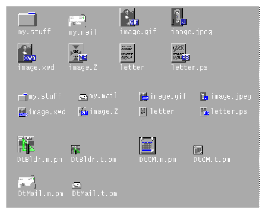
File Manager is the tool that provides for the presentation and organization of the user's file structure. The basic types of iconic objects displayed in File Manager are files, directories (folders), executables, and actions. These objects are referred to as documents, folders, and applications. File Manager displays the icons in two sizes, called Icon and Small Icon views in the Set View Properties dialog box. Icon is 32x32 pixels and Small Icon is 16x16 pixels. Figure 43 shows both icon sizes.
Figure 43. File Manager Icons at Sizes 32x32 and 16x16.
View figure. |
Documents, folders, and applications are represented by three different shapes. Documents are vertical rectangles meant to look like pieces of paper. Folders are horizontal rectangles with a tab to look like a file folder. Applications can be any shape and use the entire icon square. All objects in File Manager should indicate to the user that they can be manipulated, that is, dragged and dropped.
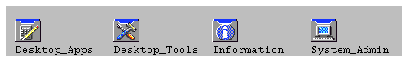
The Application Manager is similar to File Manager, but its focus is on holding applications rather than documents. All network-accessible applications in the desktop are placed here in containers, called application groups (rather than folders).
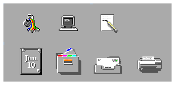
Application Manager is like a "network store." This is the place where the user goes to find the latest applications available on the system. Figure 44 shows an example of the Application Manager's group icons.
Figure 44. Application Manager Group Icons.
View figure. |
Application group icons are like folders in that they represent a collection of objects, in this case related objects. If your application requires support files or includes sample files, you can design your own application group icon that represents where a user can get the related files for your application.
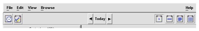
The Front Panel is the control panel for the desktop and usually appears at the bottom of the screen. Front Panel icons provide quick access to the user's most commonly used applications.
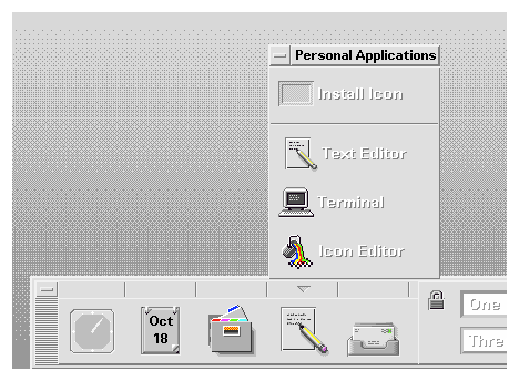
The Front Panel also has subpanels of icons that the user can access with the arrow buttons on the Front Panel. The subpanel is an extension of the Front Panel icon. For example, Figure 45 shows the Personal Applications subpanel open. The user can add applications to this subpanel by dropping them on the Install drop site. The user can choose to promote icons in the subpanel to the Front Panel via the pop-up menu.
Figure 45. Front Panel and Subpanel Icons.
View figure. |
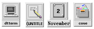
Minimized window icons appear on the desktop when a window is minimized. The icon should represent the application that controls the minimized window, as shown in Figure 46. These icons are different from the icons used in the Front Panel in that they represent running applications, although they are the same size.
Figure 46. Minimized Window Icons.
View figure. |
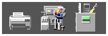
Other graphic elements include button graphics, tool bar graphics, and graphics used as labels. A tool palette in a paint program is an example; a document orientation button (landscape or portrait) in a printer dialog box is another. These are graphics that you create for use in your application and that are not used elsewhere. Figure 47 is an example of some other graphic elements (tool bar graphics).
View figure. |
When designing icons for a CDE application, you must be aware of the available color palette and the dynamic mapping of colors.
CDE icons use a palette of 22 colors:
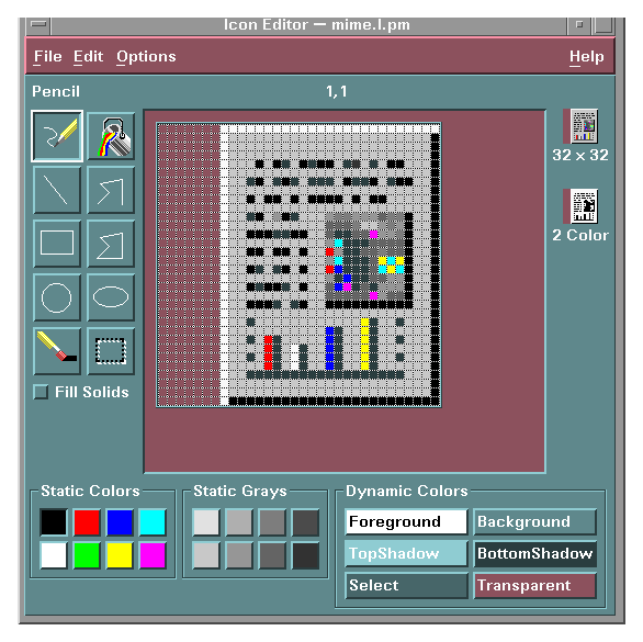
These colors are the default colors in the Icon Editor, which is the recommended tool for creating desktop icons. Figure 48 shows the Icon Editor and its color palette. This limited palette was chosen to maximize the attractiveness and readability of icons without using an unnecessary number of colors.
If you use more than the 22 icon colors, then your icons may experience color-flashing effects that can make the icon unreadable. The best way to ensure predictability of appearance of your icons is to use only the 22 colors in the desktop palette.
Figure 48. Icon Editor Color Palette.
View figure. |
It is important to understand the limited role of the dynamic colors. These represent the colors used to display the user interface elements on which your icon appears. If your icon appears in File Manager, File Manager determines what the background color is. If the user changes the color palette in Style Manager, the colors in the user interface change to match, and the background color on which the icons are displayed changes.
In general, dynamic colors have little use in most icons. There are two ways they are used:
Figure 49. Dynamic Color Shadows.
View figure. |
The philosophy behind the graphic language of the desktop is that users benefit if the computer world parallels the real world. This extends from the three-dimensional appearance of windows and controls, such as push buttons and menu bars, to the general appearance of icons.
Design your icon primarily to use the eight static grays; use the eight static colors mostly as accents. The eight static colors are strong and can easily be overused. The static grays allow icons to blend gracefully with the already colorful desktop environment. You can dither the static colors with the static grays to tone the colors down for coverage of larger areas. You can also use the grays to smooth the edges of icons. This is sometimes referred to as "anti-aliasing."
Do not use dynamic colors in File Manager icons because the appearance of the icon will change when the user changes color palettes. Such a change could be inappropriate as well as unpredictable.
Icons have various graphical styles. The most basic icon consists of a simple black outline. However, as color is added, the style resembles that of a coloring book, with color added within the black lines. This is most effective when done on white backgrounds.
CDE, with its pervasive use of colored and medium-value backgrounds, uses both lighter and darker shades to create fairly realistic images. You are encouraged to explore this style.
Another element of style is the point of view taken in portraying the object. CDE uses a head-on view, as shown in Figure 50, usually from slightly above if the object in question is a three-dimensional one, such as a printer. You should use a treatment that gives the icon a slight dimensional quality, as this reinforces the perception that the icon can be dragged and dropped.
Figure 50. Examples of Three-Dimensional Icons in CDE.
View figure. |
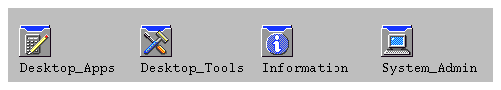
The application icon is the most important icon you will design. This is the place for your product identity, as well as a clear indication to the user of what your application does. The application icon is what the user opens to run your application.
There are no shape conventions for application icons. They can fill the entire icon bounding box or they can be irregular in shape. It is recommended that your icon appear three-dimensional. Figure 51 shows some CDE icons. You can use these icons as templates when designing your own icons.
Figure 51. Application Icons That CDE Uses.
View figure. |
The application group icon represents the container in which the user finds your application, as well as any other files you may choose to include, such as information or sample files. Design the icon in such a way that the user knows it is a container, such as a folder or box.
The concept that Application Manager uses is that of an icon based on accordion-style folders. This icon is large enough that you can stamp images on the front of it to indicate to the user what kinds of items are inside. Figure 52 is an example of application group icons.
Figure 52. Application Group Icons.
View figure. |
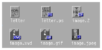
A document icon should help the user understand what kind of data is stored in that document icon and what application is associated with the document. Figure 53 shows a number of CDE document icons that you can use as templates when designing your own document icons.
Applications that support multiple file formats need different document icons for the different output formats. Rather than creating a distinctively different graphic for each format, you might use the same graphic for the basic file and add a tag to, or a small label in, the icon to delineate the format.
In the case of the document icon, the basic rectangle of the document is left-aligned in the icon square. If you use the tag approach, place the tag on the right side of the icon, half on and half off the basic icon, but not obliterating the descriptive graphic, as shown in Figure 53.
View figure. |
The desktop is different from the application spaces you may be familiar with in the following ways:
Table 11. RGB Values for Common Desktop Environment Icon Colors
| Color | RGB Values Decimal | RGB Values Hex | Grays | RGB Values Decimal | RGB Values Hex |
|---|---|---|---|---|---|
| Black | 0,0,0 | #00 | Gray1 | 222,222,222 | #de |
| White | 255,255,255 | #ff | Gray2 | 189,189,189 | #bd |
| Red | 255,0,0 | #ff0000 | Gray3 | 173,173,173 | #ad |
| Green | 0,255,0 | #00ff00 | Gray4 | 148,148,148 | #94 |
| Blue | 0,0,255 | #0000ff | Gray5 | 115,115,115 | #73 |
| Yellow | 255,255,0 | #ffff00 | Gray6 | 99,99,99 | #63 |
| Cyan | 0,255,255 | #00ffff | Gray7 | 66,66,66 | #42 |
| Magenta | 255,0,255 | #ff00ff | Gray8 | 33,33,33 | #33 |
This section discusses the details you need to know to create icons that display correctly in CDE, such as formats, resolutions, sizes, naming, and so on.
CDE runs in both color and monochrome modes, so you must create your icons in two formats: XBM (X bitmap) for monochrome and XPM (X pixmap) for color. The Icon Editor saves icon files to both formats.
On the desktop, buttons and palettes can use either the XBM or XPM formats. You should use the XPM format wherever possible for your button, palette, and tool bar graphics.
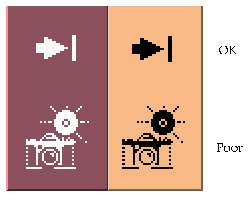
The XBM file format has only two colors: foreground and background. On the desktop, the foreground color is not fixed, but varies according to the background color. A color scheme with a dark gray background might cause any text or graphics to appear white. However, a color scheme with a light gray background will cause text and graphics to appear black.
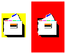
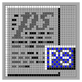
Inverting the foreground color may have a strange effect on certain icons. For something simple, like an arrow shape, there is no adverse consequence. But for other images, the negative version created by inverting the foreground color might be illegible and, therefore, unusable. Figure 54 shows the consequences of reversing the foreground color in monochrome mode.
Figure 54. Monochrome (XBM) Bitmaps with Foreground Reversal Consequences.
View figure. |
CDE accommodates three display resolutions: low resolution (640x480 pixels), medium resolution (800x600 pixels), and high resolution (mega-pixel). The size of the Front Panel and some of the icons change automatically, depending on the display resolution. For this reason, your application must provide different icon sizes.
CDE has three icon sizes: 16x16, 32x32, and 48x48, referred to as
16, 32, and 48. (They have suffixes of .t, .m, and .l, respectively.) If your
application comes from the PC domain, then the size 16 and 32 icons are
familiar sizes. Table 12 defines where each size is used.
Table 12. Icon Sizes and Usage
| Component | Low Resolution | Medium Resolution | High Resolution |
|---|---|---|---|
| File Manager | 32,16 | 32,16 | 32,16 |
| Application Manager | 32,16 | 32,16 | 32,16 |
| Front Panel | 32 | 48 | 48 |
| Subpanels | 16 | 32 | 32 |
| Front Panel Controls | 16 | 16 | 16 |
| Minimized Window | 32 | 48 | 48 |
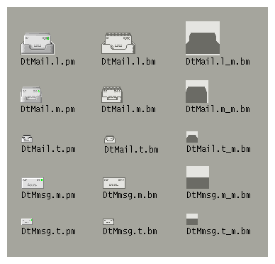
Table 13 lists the icons you need to create for an application. A total of 16 icon
files are needed, assuming one of each type and size. Figure 55 shows an example set of icons.
Table 13. Minimum Required Icon Set
| Type of Icon | 16 Color | 32 Color | 48 Color | Mono. 16 | Mono. 32 | Mono. 48 |
|---|---|---|---|---|---|---|
| Application icon | X | X | X | X | X | X |
| Document or file icon | X | X | X | X | ||
| Application container icon | X | X | X | X | ||
| Minimized windows | X | X |
Figure 55. Minimum Required Set of Icons for Mailer.
View figure. |
The basic name for the icon must be no more than seven characters. The
size and color suffixes are appended to the name, as shown in Table 14.
Table 14. Icon Naming Conventions
| Size | COLOR | B&W | B&W Mask |
|---|---|---|---|
| 48 | Iconame.l.pm | Iconame.l.bm | Iconame.l_m.bm |
| 32 | Iconame.m.pm | Iconame.m.bm | Iconame.m_m.bm |
| 24 | Iconame.s.pm | Iconame.s.bm | Iconame.s_m.bm |
| 16 | Iconame.t.pm | Iconame.t.bm | Iconame.t_m.bm |
The suffix .pm is for the XPM format. The suffix .bm is for the XBM format. The suffix _m refers to the mask for the black-and-white icon.
You do not have to provide icons in all these configurations. Table 13 lists the required icons. For example, the .s icons are typically used for tool bars, which your application may not have.
Depending on the graphic you use for your icon, the bits may not take up the entire space allocated for the icon. The recommended rules for where the empty space goes in a desktop icon are:
Figure 56 is an example of a left-aligned 32x32 icon with a tag.
Figure 56. Left-Aligned 32x32 Icon with Tag.
View figure. |
There is no size 48 requirement for the document or application group icons because neither are expected to be used for a minimized window icon (you use the tool's icon instead) or in the Front Panel. A user might, however, promote one of these icons to the Front Panel.
The icons that appear by default in the Front Panel have a slightly different appearance from File Manager icons. These icons cannot be dragged and dropped and are thus given a more permanent look by appearing to be etched into the surface.
You do not have to provide size 48 icons with an etched appearance. Since you cannot determine if and when your icons will be used in the Front Panel, you should not design specifically for this usage; instead, design for File Manager usage, which is more common.