[ Previous |
Next |
Contents |
Glossary |
Home |
Search ]
Motif and CDE 2.1 Style Guide Reference
Emphasis (Cue)
Reference
Description
Emphasis is highlighting, color change, or some other visual indication of
the condition of an element or choice, and the effect of that condition on the
user's ability to interact with it. Emphasis can also give the user
additional information about the state of an element or choice.
The types of emphasis are:
In-use
Selected
Unavailable
Source
Target
Ready
Default
Interacted
Focus
In-Use Emphasis (Cue)
In-use emphasis is a visual cue that indicates that an object is in
use, for example, if a view of the object is being displayed in a window.
Figure 18. In-Use Emphasis.
When to Use
RecommendedWhen a user opens a window on an object represented by an icon, display
in-use emphasis on the icon.
RecommendedIf the user invokes a task that uses an object represented by an icon,
display in-use emphasis on the icon.
Guidelines
RequiredRemove in-use emphasis from an icon for an object when all windows that
contain a view of that object have been closed and all tasks that use that
object have completed.
RecommendedDisplay in-use emphasis on each instance of an icon for an object.
Supplemental Related Topics
For more information, see the Icon reference page.
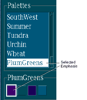
Selected Emphasis (Cue)
Selected emphasis is a visual cue that indicates that an element is
selected.
Figure 19. Selected Emphasis.
When to Use
RequiredDisplay selected emphasis on the primary selection, whether or not the
control containing it has focus.
RequiredDisplay selected emphasis on a persistent selection when the control
containing it has focus.
RecommendedDisplay selected emphasis on a nontextual persistent selection, whether or
not the control containing it has focus.
Guidelines
RecommendedDisplay selected emphasis by changing the foreground and background colors
of the selected element to those specified by the operating environment.
RecommendedDesign the rendition graphics for elements that use a variety of colors to
have distinct background pixels, preferably around the perimeter of the image.
RecommendedIf your application supports a secondary selection mechanism in addition
to a primary selection (for example, during quick transfer), display selected
emphasis for the secondary selection by using the foreground color to draw a
box around a graphic element or to underline a text element.
OptionalIf a selected element uses a variety of colors in its rendition graphic,
display selected emphasis by changing the background pixels to the background
color specified by the operating environment.
Essential Related Topics
For more information, see the Selection reference page.
Unavailable Emphasis (Cue)
Unavailable emphasis is a visual cue that indicates that a choice or
control is not available. Unavailable emphasis is sometimes called "dimmed
emphasis" or "dimming" in some environments.
Figure 20. Unavailable Emphasis.
When to Use
RequiredDisplay unavailable emphasis on choices or controls that represent
operations that cannot be activated in the current context.
Guidelines
RequiredIf a choice is never available to a particular user, do not display the
choice rather than displaying it with unavailable emphasis. For example, if
the system administrator assigns read-only access to a user, destructive
choices such as Cut or Delete should not be displayed.
RequiredDo not include unavailable choices in lists and option menus.
RecommendedProvide a warning signal when a user attempts to interact with a choice or
control that is displayed with unavailable emphasis.
RecommendedWhen the contents of a list are variable from one presentation to the
next, such as a list of documents, avoid displaying them with unavailable
emphasis; instead, do not include choices in the list that are unavailable.
RecommendedIf a user attempts to choose an element that is currently displayed with
unavailable emphasis, indicate in the information area that the choice cannot
be activated and that requesting help will explain why it is unavailable.
RecommendedDisplay unavailable emphasis by dimming the choice or control that the
user cannot interact with. For example, indicate a menu choice that is
unavailable by changing every other pixel to the background color.
Supplemental Related Topics
For more information, see the Choice reference page.
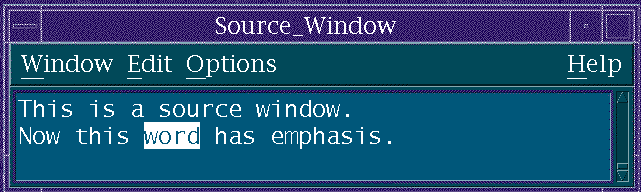
Source Emphasis (Cue)
Source emphasis is a visual cue that indicates the element from which a
user made a request or initiated a transfer operation.
Figure 21. Source Emphasis.
When to Use
RecommendedDisplay source emphasis on the source elements during a drag-and-drop
operation.
RecommendedDisplay source emphasis on an element while a pop-up menu is posted from
that element.
RecommendedDisplay source emphasis on an element if an action message that applies to
that element is displayed.
OptionalDisplay source emphasis on a selectable element if the pointer is on the
element and the user is not in the middle of a selection operation.
Guidelines
RecommendedDisplay source emphasis by reducing the contrast of the element being
manipulated. For example, change an icon for an element by changing every
other pixel to the background color, thus making the icon appear to dim.
Essential Related Topics
For more information, see the Direct Manipulation reference page.
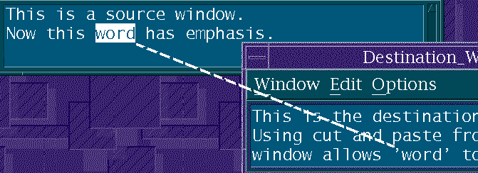
Target Emphasis (Cue)
Target emphasis is a graphical cue that indicates an element
representing an object (or other application entity) that will receive the
results of a transfer operation.
Figure 22. Target Emphasis.
When to Use
RequiredDuring a drag-and-drop operation to a target element in which a drop is
likely to succeed, display target emphasis on the target element when the
pointer is on that element.
RecommendedDuring a drag-and-drop operation, display source emphasis on the source
element.
Guidelines
RecommendedWhen a target element is an icon that represents an object, do not display
target emphasis on other icons for the object.
RecommendedDesign target emphasis so that it will be visible in addition to any other
forms of emphasis that could be currently visible on an element. For example,
display both target emphasis and selected emphasis on a selected element that
is the target of a drag-and-drop operation.
RecommendedDisplay target emphasis as a solid line around the target element.
RecommendedWhen a target element is a window that contains a view of a container,
display target emphasis as a solid thin line around the inside of the window
adjacent to the border.
OptionalWhen elements in a selection scope are maintained in some order, use a
graphic element as a marker placed between the items to indicate that the
element (or elements) being dragged will be inserted between those items. The
placement of the marker should indicate that the dragged element (or elements)
will be added after the element that precedes the marker and prior to the
element following the marker.
Essential Related Topics
For more information, see the Drag-and-Drop Transfer reference page.
Ready Emphasis (Cue)
Ready emphasis is a graphical cue for an element, used when the SELECT
button is pressed, to indicate that the choice represented by that element
will be activated or toggled. Ready emphasis is called "armed
emphasis" in some environments.
Figure 23. Ready Emphasis.
When to Use
RequiredDisplay ready emphasis on a control if the action will be activated or
toggled when the user completes the current action.
Guidelines
RequiredWhen the pointer is located on an element that represents a choice and the
user presses the SELECT button, display ready emphasis to indicate that
releasing SELECT activates or toggles the choice. Modify the emphasis as
follows if the user moves the pointer:
If the pointer is moved outside of the element while SELECT is pressed,
change the element's appearance back to its normal condition.
If the pointer is moved back inside the element while SELECT is still
pressed, redisplay the ready emphasis on the element to indicate pending
activation or toggling.
RequiredRemove the ready emphasis from the selected element when the user moves
the pointer from the element, whether or not the action that would activate or
toggle the choice was completed or when the user cancels the action.
RecommendedReady emphasis for a value indicates the value of the choice if it were
toggled.
Essential Related Topics
For more information, see the Selection reference page.
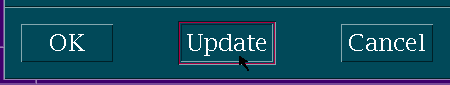
Default Emphasis (Cue)
Default emphasis is the emphasis on a choice that indicates that it
would be activated if the user requested the default action.
Figure 24. Default Emphasis.
When to Use
RequiredDisplay default emphasis on the push button whose action corresponds to
the current default action.
Guidelines
OptionalProvide default emphasis around a push button by drawing a border around
it.
Essential Related Topics
For more information, see the Default Action reference page.
Interacted Emphasis (Cue)
Interacted emphasis is emphasis on a control that indicates that it is
the last control containing an editable selection scope on the user's
display with which the user interacted. In explicit mode, it is the last such
control that had focus; in implicit mode, it is the last such control to which
a key or mouse button press or release was directed.
When to Use
RequiredIn explicit mode, display interacted emphasis on the last control within a
selection scope that had input focus.
RequiredIn implicit mode, display interacted emphasis on the last control within a
selection scope that received input.
Guidelines
RecommendedIn text, show interacted emphasis by displaying the cursor.
Essential Related Topics
For more information, see the Input Focus reference page.
Focus Emphasis (Cue)
Focus emphasis is emphasis on a control that indicates it is the
control to which input will be directed. Always use focus emphasis when an
explicit focus policy is in use. Focus emphasis is optional when an implicit
focus policy is in use since the pointer location specifies the control that
will receive input.
Figure 25. Focus Emphasis.
When to Use
RequiredWhen an explicit focus policy is in use, use focus emphasis to indicate
which control has focus.
OptionalWhen an implicit focus policy is in use, you can use focus emphasis to
indicate which control has focus.
Essential Related Topics
For more information, see the Input Focus reference page.
[ Previous |
Next |
Contents |
Glossary |
Home |
Search ]