[ Previous |
Next |
Contents |
Glossary |
Home |
Search ]
Motif and CDE 2.1 Style Guide Reference
Check Box (Control)
Reference
Description
A check box is a control for displaying a value choice that has two clearly
distinguishable states and may have a third, indeterminate state. If a
selection contains elements that have two different states (for example, a
text selection containing both bold and normal text), the check boxes can show
an indeterminate state. You typically use check boxes in a group to provide a
tab group of alternatives or to set options in an application. Check boxes are
also known as check buttons.
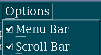
Figure 4. Check Box.
When to Use
RequiredUse a check box to display an individual value choice that can be set to
on or off.
RequiredUse a group of check boxes for value choices that are not mutually
exclusive and can each be set to on or off.
RecommendedUse a check box only if the user will clearly understand the meaning of
the choice when it is set or unset. For example, provide a check box next to
the Bold value choice to indicate that the selected text is rendered in a bold
font.
RecommendedWhen a value choice is displayed in a menu other than an option menu and
is part of a group of choices that are not mutually exclusive, use a check
graphic to the left of the value choice to indicate whether it is set or
unset. For information on bidirectional and vertical language support, see
Chapter
11.
Guidelines
RecommendedWhen a user activates a check box from a group of check boxes, do not
change the state of any other check boxes within the group.
OptionalSetting one check box in a group can override remaining check boxes; when
the first check box is set, make the others unavailable. For example, a group
of check boxes could have the labels Plain, Bold, Italic, and Underline.
Setting Plain unsets the other check boxes.
RequiredWhen a check box is initially displayed in a set or unset state, toggle
only between those two values.
RequiredWhen a check box is displayed in an indeterminate state, toggle from
indeterminate to set to unset.
RequiredWhen a check box represents a property shared by more than one selected
element:
Show it as set if all of the selected elements have that property turned
on. For example, if all of the text in a text selection is bold, and a check
box is used to indicate whether the selected text is bold, show the check box
as set.
Show it as unset if none of the selected elements have that property
turned on. For example, if none of the text in a text selection is bold, show
the check box as unset.
Show it as indeterminate if some, but not all, of the selected elements
have that property turned on. For example, if only some of the text in a text
selection is bold, show the check box as indeterminate.
RequiredWhen a check box represents a property shared by more than one selected
element, toggling it to a particular state has the following effect:
Toggling it to set ensures that all of the selected elements have that
property. For example, toggling the Bold check box to set makes all the
selected text bold.
Toggling it to unset ensures that all of the selected elements do not have
that property. For example, toggling the Bold check box to unset unbolds all
the selected text.
Toggling it to indeterminate gives each selected element the value for the
property it had when the check box was displayed as indeterminate.
RequiredA check box consists of a check graphic and a label. The check graphic is
displayed to the left of the label. For information on bidirectional and
vertical language support, see Chapter
11.
RecommendedWhen set, the check graphic is one of the following:
Checkmark
Cross
Box
Checkmark in a box
Cross in a box
When unset, the check graphic is empty or an empty box.
RecommendedThe indeterminate state of the checkbox is represented by shading or
otherwise diminishing the contrast between the check graphic in the on state
and the background.
RecommendedIf the box is to be filled, fill the box with an appropriate color
different from the foreground and background color on displays that support
multiple colors.
RecommendedIf a mark is displayed in the check box, it is displayed in the foreground
color on displays that support multiple colors.
Essential Related Topics
For more information, see the Control reference page.
Supplemental Related Topics
For more information, see the Choice and Radio Button (Control)
reference pages.
[ Previous |
Next |
Contents |
Glossary |
Home |
Search ]