|
 |
Reports are first generated in the XML format and then
transformed in a SVG file that can be viewed in graphical form using the
Adobe SVG Viewer.
RULA Analysis -> XML Report -> SVG View
It is important to understand that in order to show a graphical report,
an XML report must be generated first and the external SVG plug-in must
be installed on the local machine. To facilitate the comprehension of
this highlight, let us explain how XML and SVG are used.
XML (Extensible Markup Language): This language is used
to save any kind of data in a universal text format. In the case of this
highlight, it is used to save the results of the RULA analysis in a
format that is purposefully easy to transform into a graphical
representation.
SVG (Scalable Vector Graphics): SVG is a language defined
by the W3C (World Wide Web Consortium), which is used for describing
two-dimensional graphics and graphical applications in XML. In our case,
the SVG language is used to build a graphical representation of the RULA
analysis results.
Like in text and HTML reporting, more than one manikin’s report may be
written in the same file. To make sure that the data of one manikin is
not mixed with that of others, the first level, directly under the root,
is reserved for the Manikin tag. Then, for each manikin, the list of
simulations performed by you are logged. Note that the Simulation
tag has an Id attribute to help the user to recall the context of the
simulation. The time at which the simulation is run is saved right under
the Simulation node. The Time tag encloses the Year, the Month, the
Day, the Hour, the Minute and the Second.
Within a simulation, data is saved for each simulation
step. To differentiate the steps, the Step tag has a Time attribute,
which is a floating point number representing the time elapsed since the
beginning of the simulation in simulation units. For each step, two nodes
are listed: The Process being simulated, and the Analysis that has been
performed for that step. The Activity Tree node encloses a tree
representation of the process/task/activity of the manikin at the current
step. This tree is composed of the Process, the Task, and the Activity
tags. The Analysis node contains all the input parameters and output
results of a given analysis. For each Result or Parameter, a Value and
its Units are given.
SVG Reporting
Once an XML report has been generated, you can display
the results in a graphical representation using the power of SVG.
The View Report command pops a dialog with a graph of all the analysis
results in function of the simulation time. From there, the colors of the
curves can be customized and a threshold specification charted (with a
gray zone) on the graph to help identify the critical postures. The graph
can further be opened in the default browser window (e.g. Internet
Explorer) and saved in either image or *.svg formats. |
|
 |
-
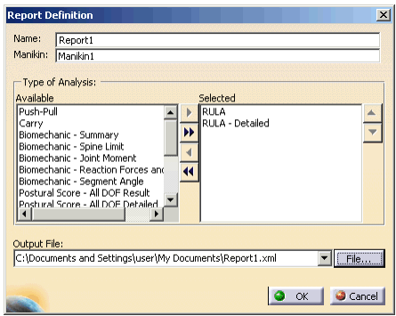
Select the Inserts a new Report. 
-
Select the manikin the new report will belong to.
Once the manikin is selected, the Report Definition dialog
box appears.
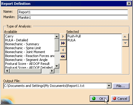
-
Select the File... button. The File
Selection Dialog box appears. Using the Drop-Down menu,
select the Files of type: Xml Files(*.xml), type in
a File name, and Open.
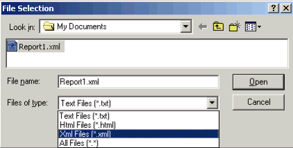
-
This changes the Output File window to save
the data as a Xml file.
-
The activation of the View Report causes the SVG dialog to be displayed.

It presents a graph view containing all the results' curves. It also
offers a toolbar with the following commands:
-
The first one is Save. It pops a
standard save dialog that allows saving the graph either in SVG
or BMP formats.
-
The second icon of the toolbar is for the Open
in default web browser, which launches your default web
browser and opens the current SVG file.
-
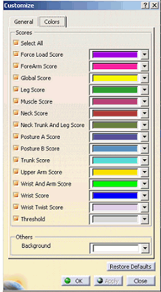
The last icon is for editing the colors of the
curves. This button pops the dialog shown below. Each result can
be hidden or shown by using the corresponding check box. This
dialog also includes a spinner that is used to set the threshold
value.
|
-
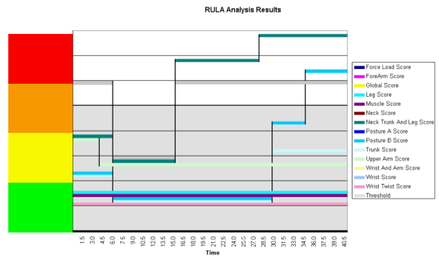
As you may notice, the title of the dialog contains the
name of the report and the title of the graph contains the name of the
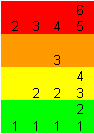
analysis. The graph itself is separated in 8 bands, one for each RULA
score value (0 to 7). For each level, a curve occupies its own space,
so the graph can be clear even if many results have the same value at a
given time. The threshold is illustrated with a 2-color (white and
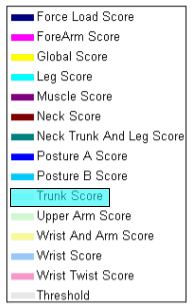
light gray) background. At the right of the graph, a legend is shown to
associate each curve with its corresponding result name. There is a
4-part red, orange, yellow and green section at the left of the graph
(vertical axis). The purpose of this zone is to display the appropriate
score depending on which result the cursor is on. The possible values
are shown.
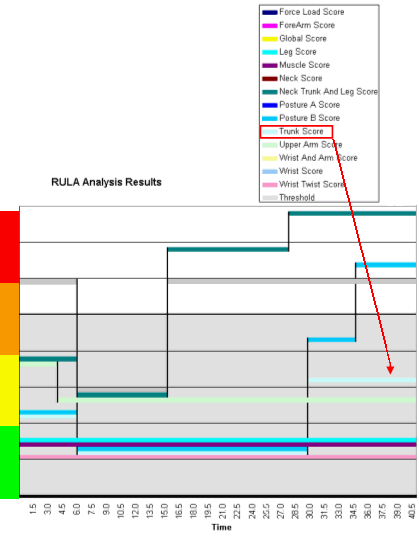
-
To illustrate the features of the SVG graph, here is a
simple example of a typical use of the View Report dialog:
-
Open the View Report dialog (it is clear which
segments and when they have to be modified). No score is
displayed if the cursor is not on a curve.
-
To differentiate the trunk scores of 3 from the
trunk scores of 4 (both in the yellow zone), place the mouse
pointer on the line of the trunk score in the legend or on the
graph.
-
The trunk scores are now displayed on the y-axis
and can be read without confusion between 3 and 4.
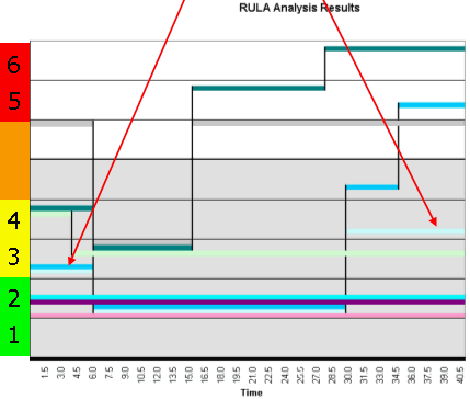
-
To be sure of selecting the right segment, the
legend item and the curve of the selected segment are
highlighted. This is to avoid selecting the scale of another
segment and thus reading a wrong value.
|
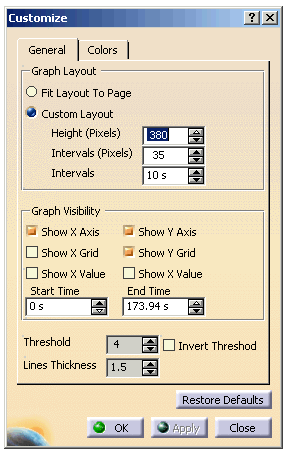
-
Selecting Customize you can change your settings.
-
You can also change the default settings for the
directory to be saved in. See
Customize Human Builder, under the Tools > Options >General tab.
|